AE Machines - Web App (2015)
UX / UI Design for responsive web app and website for AE Machines (@aemachines), a Champaign-Urbana, IL based company designing tools to make automation design and implementation accessible to a broader group of people and businesses.
AE Machines
A drag-and-drop interface design for automation design and implementation
“…A drag and drop design interface so that the young and non-technical can have fun learning about the internet of things. It will truly broaden the opportunity for the Internet of Things…”

Winner:
2017 Product Design of the Year
Recognizes a product design that is unique, improves user experience, and impacts productivity as well as the greater good
AE Machines (2015)
UX / UI Designer
Challenge
AE Machines is a Champaign, IL based company designing tools to make automation design and implementation accessible to a broader group of people and businesses. AE Machines approached us to create a web app allowing users to prototype simple machines that run on an Arduino microcontroller. Without any knowledge of code, users can choose hardware and design software by creating "movement patterns" based on senses and actions.
Objective
AE Machines needed a foundational product to live demo with users at events and generate investor interest. The web application needed a responsive user interface intended for both desktop and tablet. I created the interface, workflows (WCAG 2.0 accessibility compliant), interaction design, icons, and rebranded the AE Machines website incorporating a cleaner aesthetic to match the product.
Approach
Identifying Business Goals
I began the project identifying scope and business goals by conducting stakeholder interviews. After gaining a general understanding of the "project builder" necessities, we began to explore the journey of a customer and identify potential pain points and opportunities.
Customer Journey Map
A customer journey map noting where the UX / UI and MVP project focus would be.
Arduino Crash Course
New to automation design and Arduino, I had my developer friend Steve give me a crash course on Arduino basics. It was just enough to fill my knowledge gap and give me confidence in understanding the project.


Whiteboard Sessions with Team + Client
Collaborative sketching meetings with the client uncovered business needs and workflows that needed further iteration.


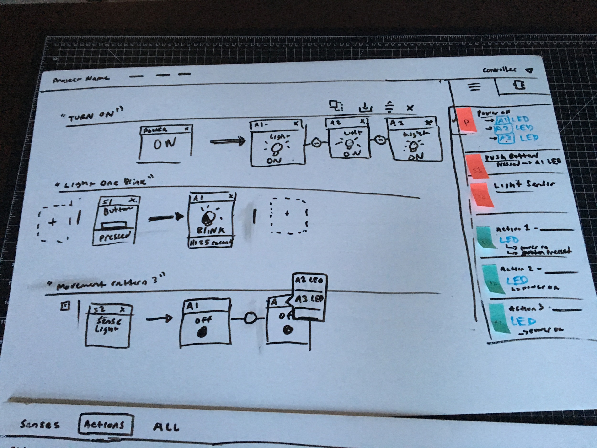
Paper Prototyping
Early ideas were vetted by running through mock project builds and testing basic layouts and workflows with a paper prototype. By failing quickly and not focusing on digital concerns, I quickly exposed problems and iterated solutions that I presented to the client and team for feedback.


Starting Small - Prototyping for Tablet
First, I prototyped in Sketch to explore layouts and flows with touch interactions at tablet size. Early rough animated wireframes were used to explore and discuss ideas with both the client and my project team. The wireframes unified the team's understanding of the project goals and helped define and evaluate the MVP features and populate the backlog.
A GIF showing a clip of early iteration that explored layout and interaction.
Another GIF showing the how the interactive elements and workflows evolved early before time and effort was put into code.
Sketching and Sharing
Iterative sketches helped explore and share finer details and interactions. It was a very effective way to elicit quick feedback from the client and the development team and kept everyone on the same page as the project moved forward.


Style Direction
Style sheets were created by Tyler Edwards (Visual Designer) to set the course for the project. Utilizing style #4 (client selected), I moved forward with the design of the web pages and the build page application.
Site Design
Expanding on the style tile, I created the layout style for the "Build" page intro, the "Transfer" and "About" pages.


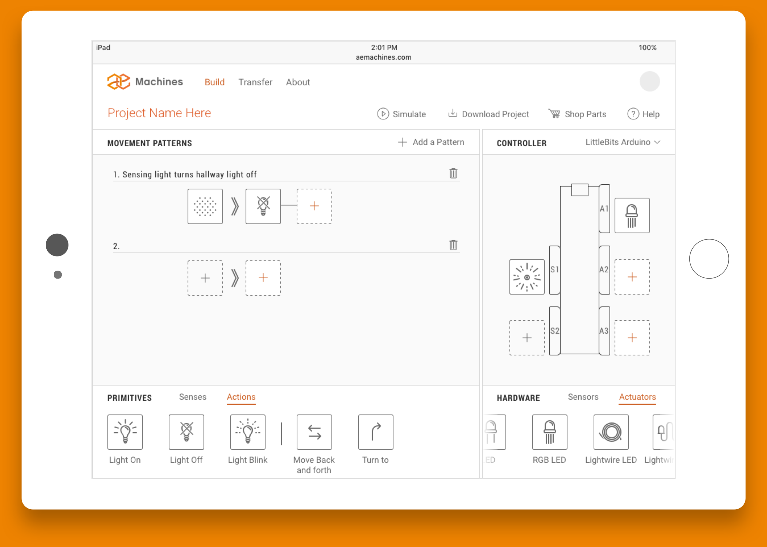
Project Builder: Responsive Design
The design had to scale from tablet to large screen and accommodate touch, mouse, and keyboard (for accessibility) inputs.
Responsive design - tablet size version
Responsive design - large screen version. Using the additional horizontal screen space, the primitive and hardware card palettes are moved to the outer edges with the content stacked vertically to better support browsing with the mouse scroll wheel.
Shopping for Parts
Selecting "Shop Parts" will generate a shopping list of the hardware parts needed to build the project. Users can browse and add parts to their amazon.com cart for easy ordering and shipping.
Card Interactions
Defining the interaction of a card, showing the expansion when selected and the ability to configure and delete.


Icon Set
We knew we wanted SVG icons to represent primitives and hardware elements on our build cards because they required less performance and could be easily manipulated to help cue users.
Onboarding and Help Ideation
The help screens were intended to be a quick introduction/onboarding feature for how to use the build interface. Given the limited time frame and budget, I was only able to deliver a visual template with examples of the implementation. It would have been great to go deeper and help develop an interactive help feature that coached users as they created their first project.


Some Kind Words from the Client:
“Jon and I worked together on the frontend redesign for the AE Machines website. Jon was great at iterating over different design ideas and incorporating our feedback into his next idea. He was able to take a dated looking website, based on technology that he was not initially familiar with, and completely change the user experience to fit the needs of our company. I would love to work with Jon again.”
“The site redesign was transformative, and Jon's role in the team was critical to that end result. His probing of our current process and careful analysis of our users led to an amazing initial direction and final result for the website. I think his greatest strength is taking nothing at face value, always digging deeper to understand nuances of the task at hand. I recommend Jon for any project — the more complex the better!”