Brand Spotlight Banner
Building a compact branded moment allowing customers to shop featured sponsored products
Client
Albertsons Companies (2023)
Role
UX Designer (Albertsons Media Collective)
Collaborators
(Product card team, Design system team)
Challenge
The Albertsons Media Collective (AMC), Albertsons Companies’ retail media network, was continuing to expand digital ad offerings across the app and website to meet the aggressive ad revenue targets for FY23 end and upcoming FY24. Competitors like Walmart and Amazon were setting the standard on digital ad strategy, leading the way with increased ad saturation and meeting customers with ads at nearly every step in the shopping funnel.
The Search page had existing sponsored placements: a slim banner at the top of the page, sponsored products in the results grid, and various medium banners displayed deep in the results grid (after every 24 products or so). Competitive again showed the way, sharing what shoppers had already become familiar with and have accepted as a norm — a branded sponsored product carousel at the top of search results.
Objective
Create a branded sponsored product carousel aka Brand Spotlight Banner for our app and website, with a few guiding principles:
Feature the brand prominently
keep the vertical height of the component to a minimum
differentiate the carousel from the search result product grid below - shoppers should understand that it is a sponsored placement.
Approach
Showing the essentials
Information drove the design. To differentiate what was essentially another carousel of products, we could either change the look of the product cards themselves, the container they are rendered in, or both.
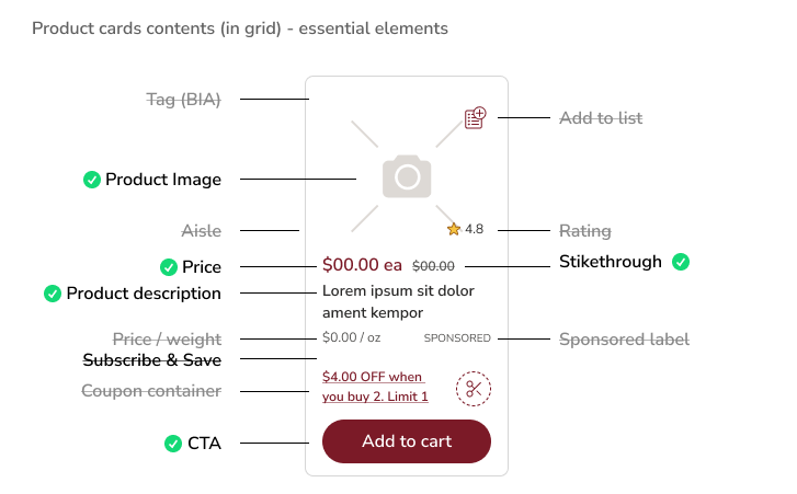
Stripping the product card to the essentials helped differentiate it from the cards in the search results grid. It also kept the product card as slim as possible. The intention was to only display the product image, price, strikethrough price, two lines of copy, and the Add button. Additionally, by tapping/clicking on the card, shoppers could go to the product details page which would display the information removed from the card.
Before starting from scratch, I reviewed other iterations of product cards or similar card designs across the app and design system to understand what, if any could be utilized to build on.
One that caught my attention was from the checkout team recent “don’t forget to add” product carousel at checkout. It had similar requirements and seemed to lend a solid foundation to iterate on. The context and elements of the search page itself also drove some decisions.
The brand spotlight banner would most likely co-exist underneath a slim banner at the top of the search page. The design (corners radius, stroke, and fill) of the slim banner above, as well as the entire family of banners also held influence.
For app, the carousel itself had to show a peek of the second product card for shoppers to understand it was a carousel and swiping would reveal more. For web, the goal at the largest responsive size (1440+) was to show four products. I was able to utilize a similar card style across both app and web to drive consistency, helping shoppers visually understand this was a sponsored piece of the page.
Future-Proofing
During my iteration process, I worked closely with the product card team who were also in the process of a product card redesign themselves. I had to consult and align often to reduce any potential future impact on the design. To help align and future-proof as much as possible, I collaborated with the design system team and built out the product card component using the latest design system tokens. This would ensure changes to any elements such as text styles, sale price styles, colors, stepper button, etc… would update with any design system push, and therefore align with the product card team’s updates as well.
Outcome
The design was successfully launched on app in Q1FY24 and has been sold ever since.
The goal of future-proofing was also achieved as the initial design successfully supported the product card team updates. As teams constantly work to improve the app, other elements on the page have changed as well and the team has since removed the background and card outline to visually fit the updated horizontal product card.


