Homepage Hero Collection
Creating a guaranteed impression for sponsored content on the homepage of Albertsons Companies’ grocery retail app and website
Client
Albertsons Companies (2024)
Role
UX Designer (Albertsons Media Collective)
Collaborators
Jason Lim (PM), Bernice Wong (Homepage Team), Stefaan De Waegeneire (Ad Ops)
Challenge
Senior leadership was focused on increasing ad revenue with sponsored placements across app and web. Competitive analysis revealed an opportunity via a guaranteed homepage impression.
Objective
Create a guaranteed impression for sponsored content on the homepage for app and web ($4.7M annual ad revenue).
Avoid pushing personalized shopper content further down the page (e.g., 'Buy it Again', 'Deals').
Avoid another significant homepage design overhaul.
The existing homepage hero banner carousel supported sponsored content (slots 2, 6), but could not ensure ad impression revenue as users may scroll or leave the page before seeing the ad.
Approach
Finding the Initial Direction
Our team initially proposed three directions for leadership review, stating pros and cons on:
Merchandising strategy
Impact to ‘Buy it again’, ‘Deals’ content below,
Design readiness
Tech/component readiness
We chose a direction with card components supporting both internal merch and sponsored content to accompany the existing hero banner carousel. We based this decision on:
leadership feedback
timeline & effort
redesigned homepage banner A/B test results
competitive analysis
creative requirements
Component Overview
The hero collection components (banner and two cards) required consistency across app and web for visual familiarity and functionality. The same creative copy and imagery needed to fit seamlessly across all sizes.
Hero Banner Updates
I began iterations to best support both sponsored content and internal merchandising campaigns. In the process, I was able to make key updates to the Hero Banner Carousel:
Converted image ratio to platform consistent 2:1
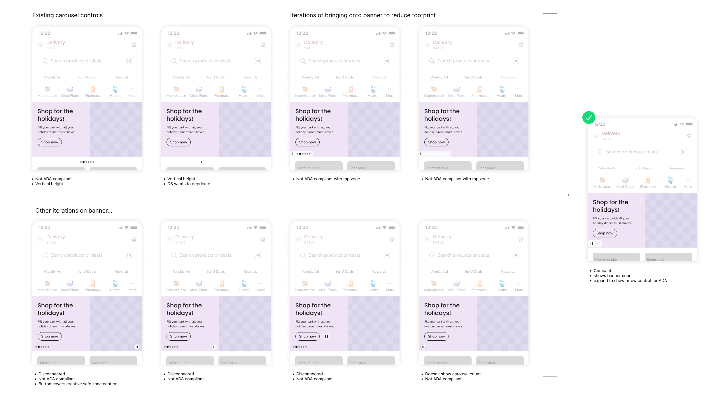
Updated the carousel control to improve interaction and accessibility.
Repositioned the sponsored label to upper right, reducing overlap of sponsored creative copy.
Designed to Scale
Placing the updated hero banner carousel (2:1 ratio) on grid guided the scaling of the cards across responsive web.
For app, I opted for a full-bleed hero banner to maximize space, act as an anchor for the top of the homepage, and distinguish itself in the hierarchy of banners. The merch and sponsored cards sat nicely underneath at a 3:2 container size.
Sponsored vs. Internal Merch Banner Component Design
A pain point for implementing sponsored creative is ensuring our component doesn’t crop vital elements and that the supplied campaign copy fits well and doesn’t interfere with the image.
I designed the sponsored hero banner component differently with a built in safeguard:
Creative would be a 1:1 image (.png) aligned to the right, providing a built-in buffer to the transparent text plate aligned left.
Container background could be filled any color, creating a full bleed effect.
1:1 creative is already an asset requirement that advertisers supply, so there was no need to send updated specs for sponsors to work with.
Banner and card component builds @1440 and on App
Carousel Control Update
Redesign hero banner carousel control, now more compact and accessible
Used less space than previous control designs
Met ADA accessibility standards
Rebuilt component for design system intake
Documented and prototyped carousel control motion/interaction for dev handoff.
Control Iterations
The carousel control needed a redesign on both app and web. Accessibility and vertical space was an issue. I updated the control design to be more compact and ADA compliant.
Prototypes: Interaction & Motion
To be as compact as possible, the control expanded and collapsed on a timer to show'/hide the next button. The prototype allowed me to fine-tune the interaction and communicate the motion specs to dev.
Prototype of carousel control expand / collapse interaction.
Prototype of carousel control advance slide interaction.
Motion specs on expand and collapse
Handoff Documentation for Development
I provided handoff guidelines showing the control states, flows, and interactions. This documentation, along with the prototypes, were crucial in communicating the design to dev and achieving the desired outcome.
Sponsored Card - The Guaranteed Impression
The guaranteed ad impression is delivered from a static sponsored card located at the top of homepage. A few design decisions were built in:
Creative safe-zone with a 1:1 product image and standardized copy count, reducing implementation errors.
Visually differentiated from the internal merchandising card.
Differentiating Sponsored Card from Merch Card
Documentation and Guidelines
I produced both internal and external hero banner and sponsored card component usage guidelines for ad partners and internal marketing.
Outcome
The updated hero banner carousel and cards went live on app in Q3 FY24 (Sept-Nov). The work is still live as of Q1 FY25.


