Controller
A new interface design for the updated RC transmitter’s embedded android touchscreen
Client Name/branding removed for NDA purposes (2016)
UX / UI Designer
Challenge
Convert the existing scroll wheel and button LCD interface to an embedded Android touchscreen experience.
Identify opportunities in the information architecture and update the interface to meet the expectations of legacy users and smartphone capabilities.
Approach
Learning by Observing ...and Some Doing
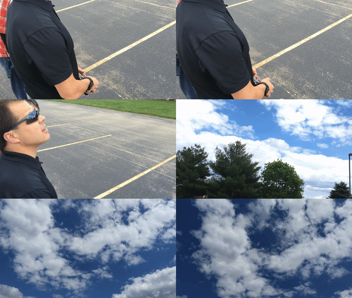
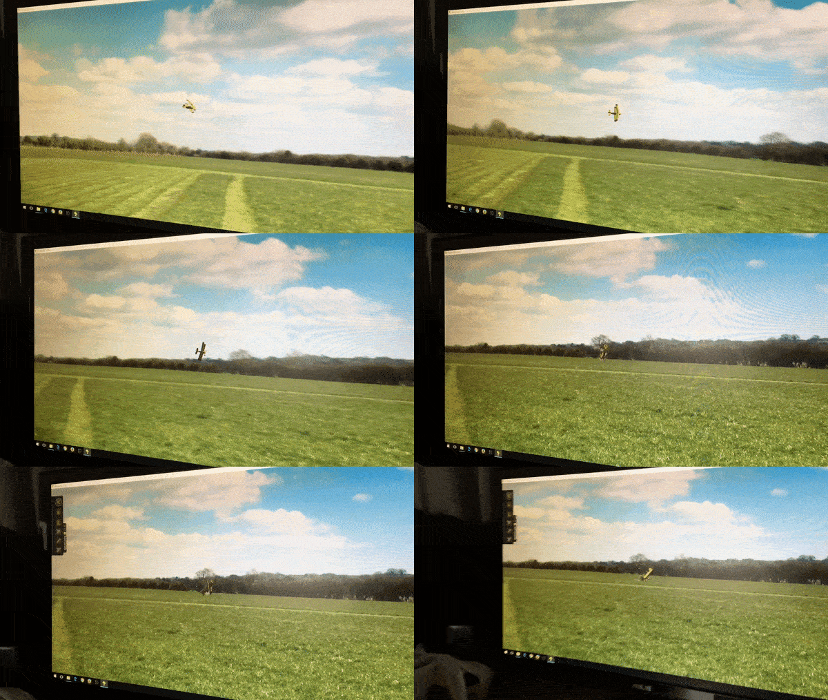
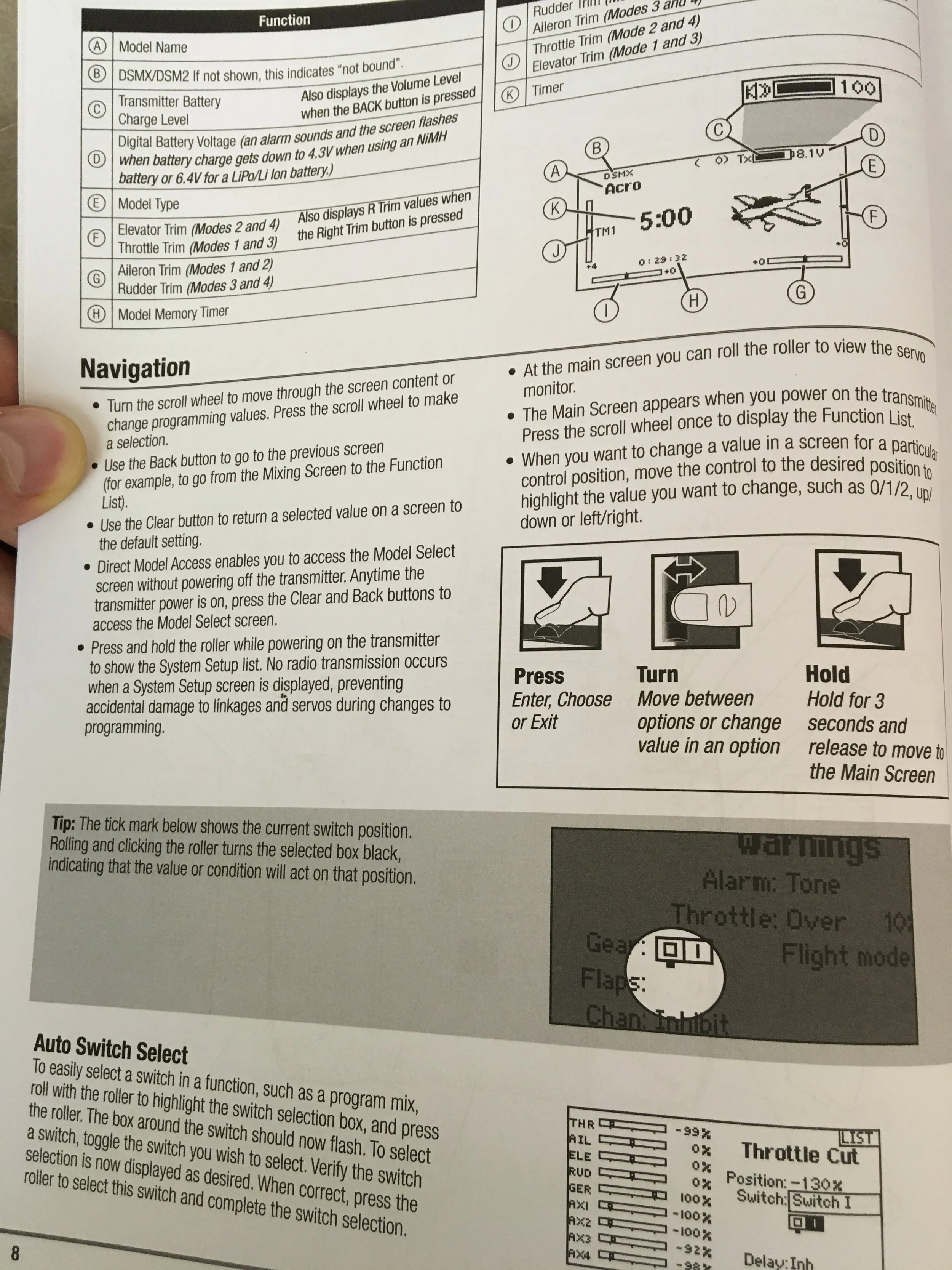
The project started with learning the basics and observing how users set up and fly their aircraft. The team did field observations and went through a crash course on aircraft setup which walked us through what would eventually be our MVP feature set. Because of our limited experience and the cost of these aircrafts, we logged hours in a flight simulator to get a better understanding of the process. I studied the existing instruction manual to learn about the features and the current system architecture in order to iterate on updated information architecture designs that would not alienate legacy users.
Early Insights and Opportunities
The updated controller featured a lower-quality embedded screen that provided some visibility issues in bright sunlight. We took several color iterations outdoors to test visibility and contrast levels early on, making sure we were designing content that could be seen and read.
Examining comfortable reach/touch zones for users gave us insight into the appropriate location and size needed for the tappable content. This was a crucial step in reducing friction and successfully replacing the older physical button workflow.
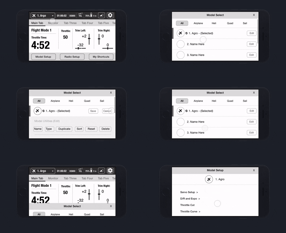
Legacy users have expectations for how to access screens through the existing menu structure and shortcuts. We wanted to smoothly transition users to the new version by blending a familiar architecture with the functionality of modern touch devices.
Exploring Opportunities in Navigation & Information Architecture
Exploring Home/Dashboard
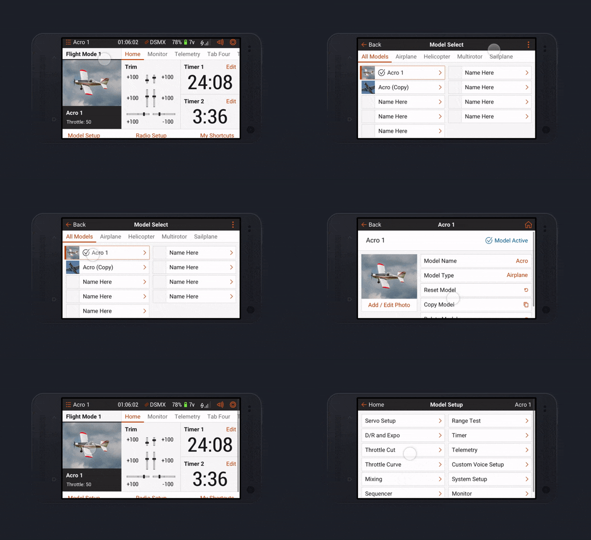
The home screen (or dashboard) is really a dynamic set of screens accessed by swiping left and right. sandwiched between an information bar at the top and main menu buttons along the bottom. The info bar remains at the top of the screen, allowing users to always see high-level information (currently connected model, model timer, connection type & signal strength, device battery life). Swiping through your dashboard series will show items like throttle timer, servo monitor, and telemetry data. The bottom menu buttons house the remaining items that are not accessed often during flight.
It was so important to observe users in their environment flying the aircraft. Of the many insights that came from observation, one of the so stupidly obvious things I could have missed if I wasn't out there: During 99% of flight time, the user's eyes are focused on the aircraft in sky, not looking down at the controller. So when they do glance down, they better be able to read the text.
Prototyping
Design library
I created a design library to keep pace with development and tackle the large volume of screens. We worked together to identify screens that the dev team could recreate using the design system for the first pass. The design system kept the development team busy while I could focus my efforts on the screens that required a redesign.

